MTG Arena on mobile is great, but it highlights one of the game’s worst accessibility issues
Word (size) up.
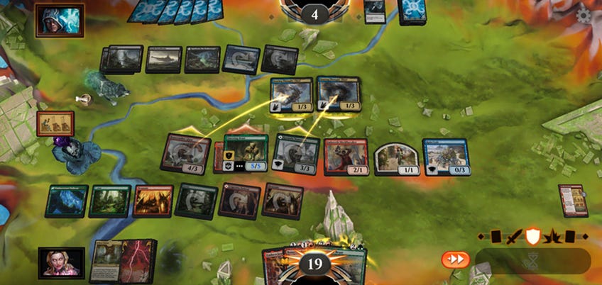
Magic: The Gathering Arena is now out on iOS, which is an exciting thing for players who’ve been waiting since it hit Android devices a few months ago. Having the game on mobile is undoubtedly a good thing for both players and also Wizards of the Coast, which is no doubt quite happy about being able to appeal to a new audience and get more people into the game.
You’ll be happy to hear that it runs well. Using the game is intuitive and smooth, and there are no noticeable lag or connection issues when playing against people online. It is, for all intents and purposes, exactly what you would hope for in a mobile port of MTG Arena’s PC app.
It can feel a little bit clunky when you’re putting together a new deck due to the small screen size and general largeness of your average finger, and interacting with specific cards as the board state gets more chaotic can be challenging as you may select the wrong thing, but it’s something you’ll adjust to the more you play it. In that aspect, at least, this is a faithful version of the game you know and love.
I’m not going to talk about the app in terms of its gameplay, because it’s still MTG Arena, for all the pros and cons that that brings. However, it being on mobile does highlight some of the issues with the game in general, among the most severe of which is the wordiness of current designs.

With the release of Strixhaven: School of Mages, we now have one of the wordiest Magic: The Gathering sets in recent memory. (Well, it was the wordiest up until this week's Full-Text Lands Secret Lair.) If you were to head to a spoiler section for the set and cast your eyes over the cards in general, you’ll be greeted with a paragraph of text for nearly every card. You still have the odd card that simply exiles a tapped creature, but the vast majority - or at least that’s how it feels - require some kind of qualification in critical thinking to parse.
With the release of Strixhaven: School of Mages, we now have one of the wordiest Magic: The Gathering sets in recent memory.
Take Mavinda, Students’ Advocate, for example. It’s a three-mana White 2/3 with flying that has an ability that reads: “0: You may cast target instant or sorcery card from your graveyard this turn. If that spell doesn’t target a creature you control, it costs 8 more to cast this way. If that spell would be put into your graveyard, exile it instead. Activate only once each turn. (You still pay the spell’s costs. Timing rules for the spell still apply.)”
I’ve been playing MTG for a fair few years now, and I write about it daily, but I can barely keep my attention focused long enough to get to the end of that description. The trouble is, the way that MTG works means that you need to have all of that writing on the card for it to not end up breaking one format or another. Even a slight change to the text results in a wildly different effect.
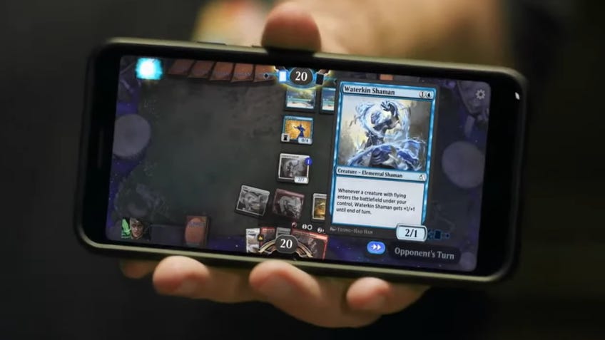
Reading all of that text on a PC or on an actual card is fine, but when you transplant it onto your average phone screen, it feels like a bit much. It’s also wildly inaccessible for players who have eyesight issues; to be honest, that’s an issue no matter where you play, but phones simply have smaller screens which makes it worse.
Without a few more options, MTG Arena on mobile is going to lock some people out of it.
I like playing MTG Arena on mobile a lot because it’s convenient; I can dip into a match more or less whenever I like and hit my daily quests without having to login on my PC, which is usually already doing 100 things at once already. However, the lack of accessibility and the increasing word count on the cards themselves is a big problem for the game at large.
Without a few more options, MTG Arena on mobile is going to lock some people out of it - including the very people who were desperate for the mobile version because they can’t play it on PC.


